PARAMOUNT+
Brand Refresh, Canadian Relaunch, Templates and Campaigns
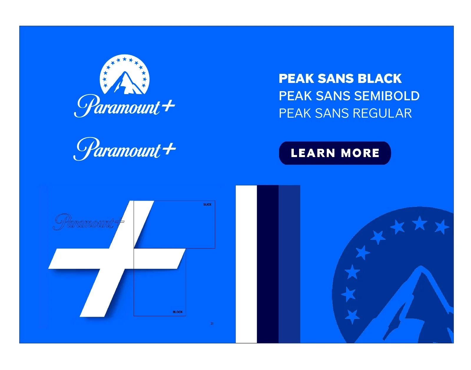
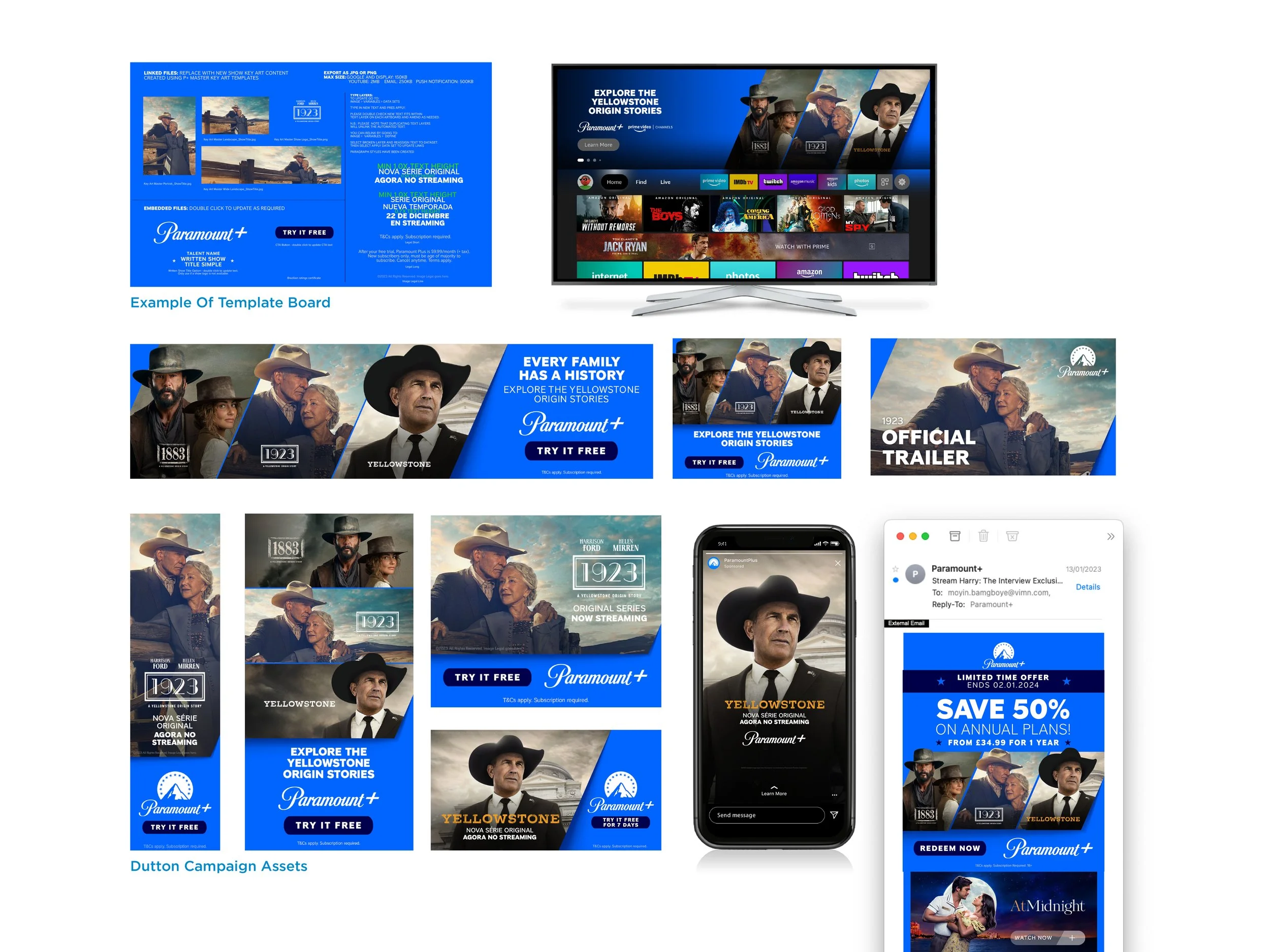
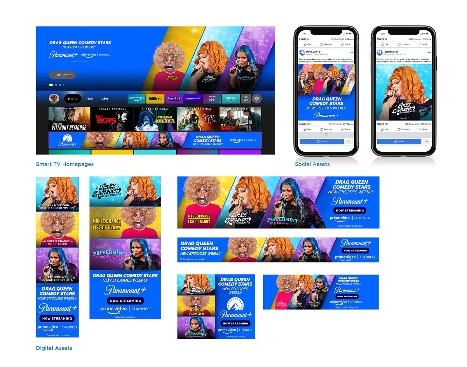
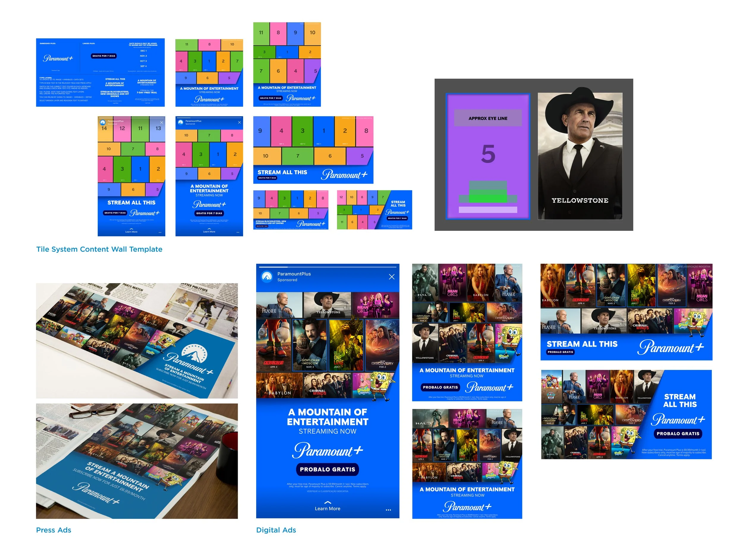
Working with Paramount Plus International team we took the existing guidelines and refined and rationalised them. A suite of assets was produced that created a globally consistent brand.
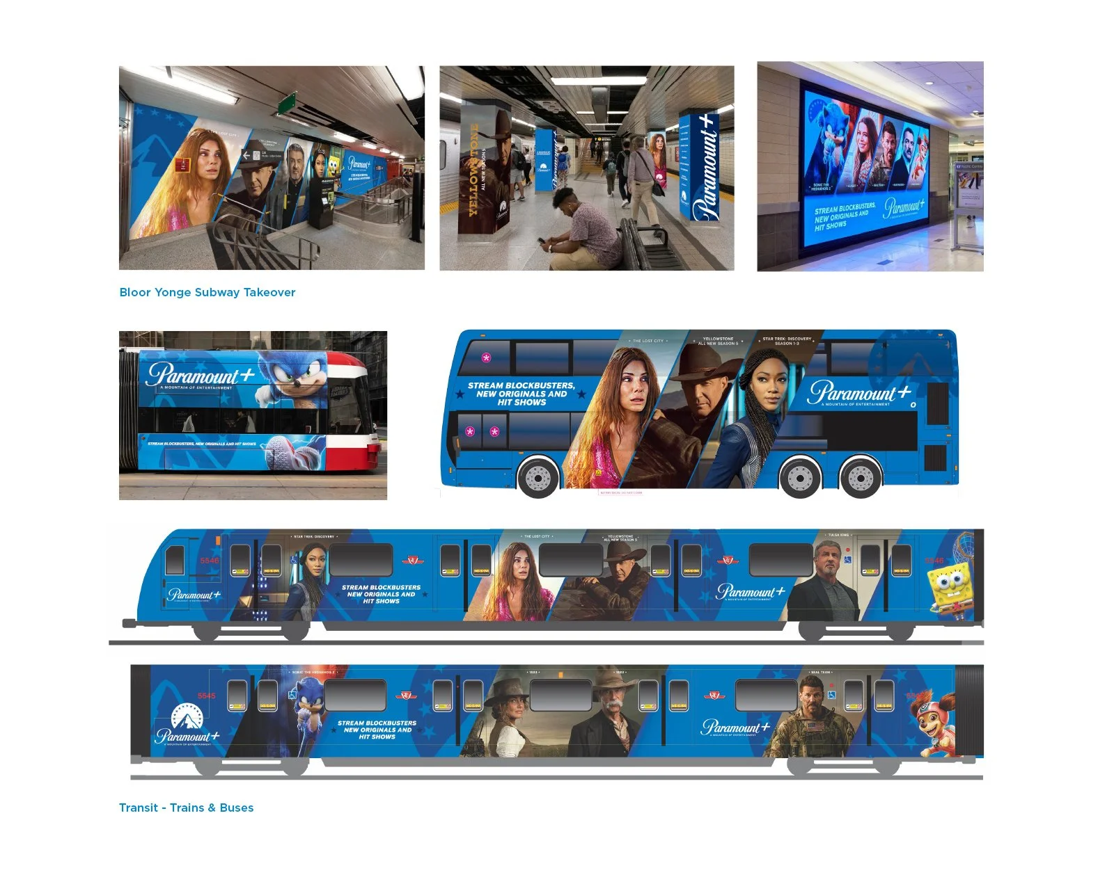
This included the creation of automated templates that reduced the creation time by around 80%, and the relaunch of the brand in Canada which doubled the subscription rate.
